Material Design - Angular
Angular
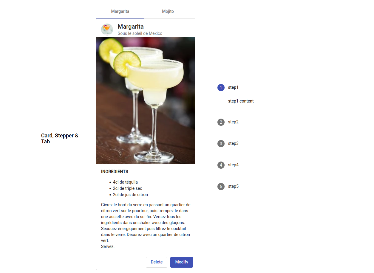
Discover with a quick HOW TO the way to manage Material Design in your Angular projects. This is a short overview of the nice and smooth UI/UX capabilities of this cross-over framework library.
The interest of Material lives in the way you can develop UI/UX very well designed very quick, so you can spend more time on the interresting part of your job, I mean javascript algorythms and high-level functionalities...
And these components are also easily customizable, so it won't look the same as your neighbour ;)
Easy setup
ng add @angular/material
After install, setup a specific module in shared/modules to manage all the required imports for your project. This way you wont load the whole library, but only the components you need.
Because you must import and export the same array of components twice, use a MATERIALS constant for both.
// shared/modules/material.module.ts
import { NgModule } from '@angular/core'

import { MatButtonModule } from '@angular/material/button'
import { MatButtonToggleModule } from '@angular/material/button-toggle'


const MATERIALS = [
  MatButtonModule,
  MatButtonToggleModule,
]

@NgModule({
  imports: MATERIALS,
  exports: MATERIALS,
})
export class MaterialModule { }
You can then import your material.module.ts in your app.module.ts.
// app.module.ts
import { NgModule } from '@angular/core'
import { MaterialModule } from './shared/modules/material.module'

import { AppComponent } from './app.component'

@NgModule({
  declarations: [
    AppComponent,
  ],
  imports: [
    MaterialModule,
  ],
  providers: [
  ],
  bootstrap: [AppComponent]
})
export class AppModule { }
Import a Material component
Except specific functionalities, you will import them the same way every time:
- Functionality: <Name> (ex: Button)
- Import JS name: <Mat[Name]Module> (ex: MatButtonModule)
- Use HTML name: <mat-[option?]-[Name]-[option?]> (ex: <mat-button>, <mat-raised-button>, etc...)
Options
Some options are generic ones, such as color (basic/primary/accent/warn). Each components gets specific options, such as FormGroup and formControlName for Input components.
You can see a demo of a few part of the huge ammount of components of this library on my demo page, while the technical explanations live on my Github README file.

